Africa's most expensive cities: rankings, drivers, and limits
The 2025 mid-year Numbeo ranking for Africa looks straightforward: a list of cities sorted by cost of living index value. But simple rankings can hide important differences in everyday experience. Abidjan is first at 44.0, Addis Ababa is second at 42.7, and Gaborone is third at 42.2. Lusaka is tenth at 33.3.[1] The ranking tells us where prices are higher in this dataset. It does not, on its own, tell us where life feels hardest for local residents.
That distinction is central to this analysis. The top ten spread is 10.7 points, which is meaningful but not extreme. At the same time, local purchasing power ranges from 10.7 to 117.3 within those same ten cities.[1] So two cities can sit near each other in the cost ranking and still feel very different once incomes are considered.
This entry uses a layered approach. It starts with city-level Numbeo data.[1] It adds Numbeo’s methodology context.[2] It then adds macro context from IMF inflation data and World Bank indicator series.[3]
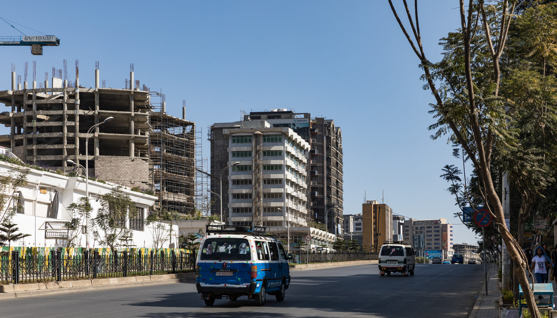
Addis Ababa city center, the second-ranked city in this snapshot (42.7).
What this analysis answers
- Which cities are highest in the 2025 mid-year cost-of-living ranking for Africa.
- Whether higher rank also means weaker affordability for local residents.
- Which basket components appear to drive pressure in this top-ten group.
- What national macro context may help explain city-level differences, without overstating causality.
The short takeaway
The top ten cities are all high-cost in this sample, but they are not high-cost in the same way. Price levels are clustered within a moderate range, while affordability is far more uneven because local purchasing power differs sharply across the same cities.[1] Groceries are a stronger average pressure point than rent in this specific top-ten basket, and macro context varies widely across countries represented in the ranking.[3]
How to read this entry
A cost of living index is a comparative measure, not a local-currency household budget.[2] Read this as a cross-sectional snapshot, not a long-term trend claim. Pair rank with local purchasing power, and treat macro indicators as country-level context attached to city rows.
Where costs are highest
At headline level, the top ten is geographically mixed. It includes West, East, North, and Southern African cities. The key concentration is by country: South Africa has three cities in the top ten, and Morocco has two.[1]
The spread between rank 1 and rank 10 is 10.7 points. Put differently, the first city is about 32 percent above the tenth city in this index (44.0 vs 33.3).[1] That is a real gap, but not a complete break. The top ten should be read as a high-cost tier, not as a winner-take-all ladder.
The top-ten mean is 37.21 and the median is 35.4.[1] Most entries sit in the mid-30s to low-40s. This is why later sections focus on affordability and basket composition, not just rank order.
Key figures
44.0
10.7
106.6
Rank profile
Top 10 Cost of Living Index Values
So what this means
This chart shows where prices are highest, but it does not show whether those prices are equally affordable for residents.
How to interpret the ranking spread
Abidjan, Addis Ababa, and Gaborone are clearly at the top of the group, but the lower half of the top ten is tightly packed. That means small rank changes can be less important than they appear in a headline. For interpretation, it is more useful to ask what sits underneath the rank.
Why rank does not equal affordability
The same cities that appear in the highest-cost group show large differences in local purchasing power. This is the central reason to separate “expensive city” from “difficult cost burden.” A city can have high prices and still offer stronger relative earning power than peers.
In this top ten, the lowest local purchasing power is 10.7 and the highest is 117.3.[1] That 106.6-point gap is much larger than the 10.7-point gap in the cost ranking itself. So affordability dispersion is wider than price-rank dispersion.
Affordability divergence inside the top ten
Local Purchasing Power in the Same Top 10 Cities
So what this means
This chart matters as much as the ranking chart when the goal is to understand cost pressure on households. Price level and affordability are linked, but they are not interchangeable.
Pretoria, Johannesburg, and Cape Town appear in the same high-cost top ten while also showing the strongest local purchasing power values in that group. Abidjan and Addis Ababa show the opposite pattern, with high cost rank and low purchasing power values. Casablanca and Rabat sit in the middle.[1]
This is where the analysis shifts from “which city is expensive” to “expensive for whom.” That distinction is usually the one that matters for real decisions.
What is actually expensive in the basket
After affordability, the next useful question is composition. Are these cities expensive mostly because of housing, groceries, restaurants, or a mix?
In this top-ten set, groceries average 34.53, while rent averages 13.32. Restaurants average 29.21, and the combined cost-plus-rent index averages 26.80. So the broad pattern is clear: groceries are closer to the headline cost level than rent is.[1]
What drives the basket in the top ten
Top-10 Average Basket Components
So what this means
In this top-ten group, food-related prices look closer to the headline cost index than rent does. For many households, that changes where pressure is felt month to month.
This does not mean housing is irrelevant in every city. It means this specific top-ten sample shows a lower rent index average than grocery and restaurant averages.[1] For real-world decisions, that is a practical signal: budget pressure can be concentrated in day-to-day consumption, not only in housing.
Country context that may explain differences
City rankings and national macro series measure different things. Putting them side by side still supports plausible, limited interpretations.
The top ten includes countries with very different 2025 inflation estimates.[3] Exchange-rate paths from 2022 to 2024 are also very different across the same group.[4] This is one reason a single explanation does not fit every city in the list.
| Country in top 10 | IMF inflation 2025 (%) | FX change 2022-2024 (%) | Urban population growth 2024 (%) |
|---|---|---|---|
| Ivory Coast | 1.0 | -2.8 | 3.49 |
| Ethiopia | 13.0 | 59.6 | 5.00 |
| Botswana | 3.4 | 9.7 | 2.29 |
| South Africa | 3.4 | 12.1 | 1.42 |
| Zimbabwe | 89.0 | 771.1 | 3.30 |
| Morocco | 1.2 | -2.1 | 1.17 |
| Zambia | 14.2 | 54.5 | 3.79 |
FX change is calculated from official LCU-per-USD series, where higher positive values indicate depreciation over the period.[4]
So what this means
The macro context is heterogeneous. Zimbabwe’s 771.1 percent FX change and 89.0 percent inflation sit in the same table as Morocco’s -2.1 percent FX change and 1.2 percent inflation.[3][4] That gap implies a concrete reading rule: similar rank outcomes can emerge from very different macro regimes, so one-cause explanations are weak.
Fast city-by-city reading notes
Use this section as a scanning guide before the detailed references. All values in this scan list come from the same top-ten Numbeo table.[1]
Abidjan: Highest cost-of-living index in the table, paired with the lowest local purchasing power value in the top ten.Addis Ababa: Very high cost rank and very low purchasing power value in this top-ten set.Gaborone: High cost rank with moderate purchasing power relative to the group.Pretoria: High cost rank but the strongest purchasing power in the top ten.Harare: Mid-top-ten cost rank with lower purchasing power in this group.Johannesburg: Similar cost level to nearby peers, but very high local purchasing power relative to most of the top ten.Casablanca: Mid-range cost rank with moderate purchasing power in this group.Cape Town: Cost level close to Casablanca and Rabat, but with high local purchasing power like other South African entries.Rabat: Similar cost level to Casablanca and a higher purchasing power value than several cities ranked above it.Lusaka: Lowest cost index in the top ten, but still part of the high-cost tier and paired with lower purchasing power than Morocco and South Africa entries.
Interpretation
Three conclusions are defensible from this dataset.
- Top-ranked cities are high-cost in relative price terms, but rank distances are moderate inside the top ten.
- Affordability differences are larger than ranking differences because local purchasing power varies sharply.
- Macro context differs enough across countries to support multi-factor explanations rather than a single-cause narrative.[3]
Two conclusions are not defensible from this dataset alone.
- That one macro variable explains city rank outcomes across the entire top ten.
- That this one snapshot establishes long-term direction for each city.
Read end to end, this entry separates three ideas clearly: price level, affordability, and macro context.
What this entry cannot settle yet
Good data reporting also means saying what remains unresolved.
This dataset cannot tell us, by itself, whether each city is becoming structurally more expensive year after year. It is a mid-year snapshot.[1] It also cannot isolate the exact share of pressure caused by currency moves, domestic inflation, supply constraints, or local policy choices, because the macro variables here are attached at country level.[4]
It also does not answer distributional questions inside each city. A single city index cannot show how pressure differs between low-income households, middle-income households, and higher-income households, or between central neighborhoods and peripheral areas. Those questions require city-level household survey and labor market detail that is outside this entry.
None of these limitations make the ranking unusable. They simply define its best use case: comparative orientation, not final causal diagnosis.
How to use this entry in real decisions
The ranking answers where prices are highest in this 2025 mid-year snapshot, but not affordability by itself.[1]
Use this sequence when comparing cities for living, work, or relocation.
- Start with the ranking chart to see which cities sit in the high-cost tier.
- Move immediately to the purchasing-power chart to test whether a high-cost city also looks less affordable in relative terms.
- Check the basket-composition chart to understand where cost pressure may sit in day-to-day spending.
- Use the macro table only as background context, not as proof of one single explanation.
For organizations setting relocation budgets or compensation, avoid housing-only assumptions. In this sample, groceries and restaurant prices sit closer to the headline index than rent, so day-to-day pressure may be broader than housing costs alone.[1]
When comparing two cities, avoid binary statements like “City A is expensive, City B is affordable.” Use conditional framing instead: “City A has a higher price index in this snapshot, but City B may still impose higher practical pressure for certain households depending on income and spending structure.”
For public communication, keep the language simple and specific. “Higher prices” is clearer than abstract wording. “Lower local purchasing power” is clearer than broad terms like “economic stress.” Clear wording increases trust and keeps non-specialist audiences engaged through the full analysis.
Limitations
- Numbeo is crowd-sourced and coverage can vary across neighborhoods and respondent profiles.
- The ranking is a 2025 mid-year snapshot, not a full time-series analysis, so it does not establish whether each city is structurally becoming more or less expensive.
- Inflation, exchange-rate, PPP, and urbanization indicators are country-level series applied as context to city rows; they are not city-specific macro indicators.
- Repeated country entries in the top ten (for example South Africa and Morocco) share the same national inflation and currency regime, so they should not be treated as independent macro observations.
- The component indices (groceries, rent, restaurants) are useful for directional comparison but do not replace city-level household expenditure surveys.
Sources
References
- Numbeo. Africa: Cost of Living Index by City 2025 Mid-Year. https://www.numbeo.com/cost-of-living/region_rankings.jsp?title=2025-mid®ion=002
- Numbeo. Methodology and Motivation. https://www.numbeo.com/common/motivation_and_methodology.jsp
- IMF. DataMapper API (PCPIPCH, WEO 2025 inflation estimate). https://www.imf.org/external/datamapper/api/v1/PCPIPCH
- World Bank. World Development Indicators API series used in this entry: PA.NUS.FCRF, NY.GDP.PCAP.PP.CD, SP.URB.GROW. https://api.worldbank.org/v2/country/all/indicator/PA.NUS.FCRF