Sending money to Sub-Saharan Africa: why it still costs too much
Imagine two people sending USD 200 to family in Sub-Saharan Africa. One route goes to Sudan. Another goes to Malawi. Same amount, same quarter, but one sender pays about fourteen times more: 43.35% versus 3.01% of transfer value.[1]
That gap is not a glitch. It is the story this entry examines.
The goal the world set and hasn’t reached
In 2015, world governments agreed on a target under the UN’s Sustainable Development Goals: the cost of sending money internationally should fall below 3% of the transfer amount. Corridors are specific send-country to receive-country routes, and those with costs above 5% should be eliminated.[2]
It is now Q1 2025. The global average is around 6.4% to 6.5%, depending on which dataset you use.[2][4] Sub-Saharan Africa is close to 9%.[4] No Sub-Saharan destination country in this analysis is below 3%. Twenty-eight of thirty-three are above 5%.[1]
The target has not been met.
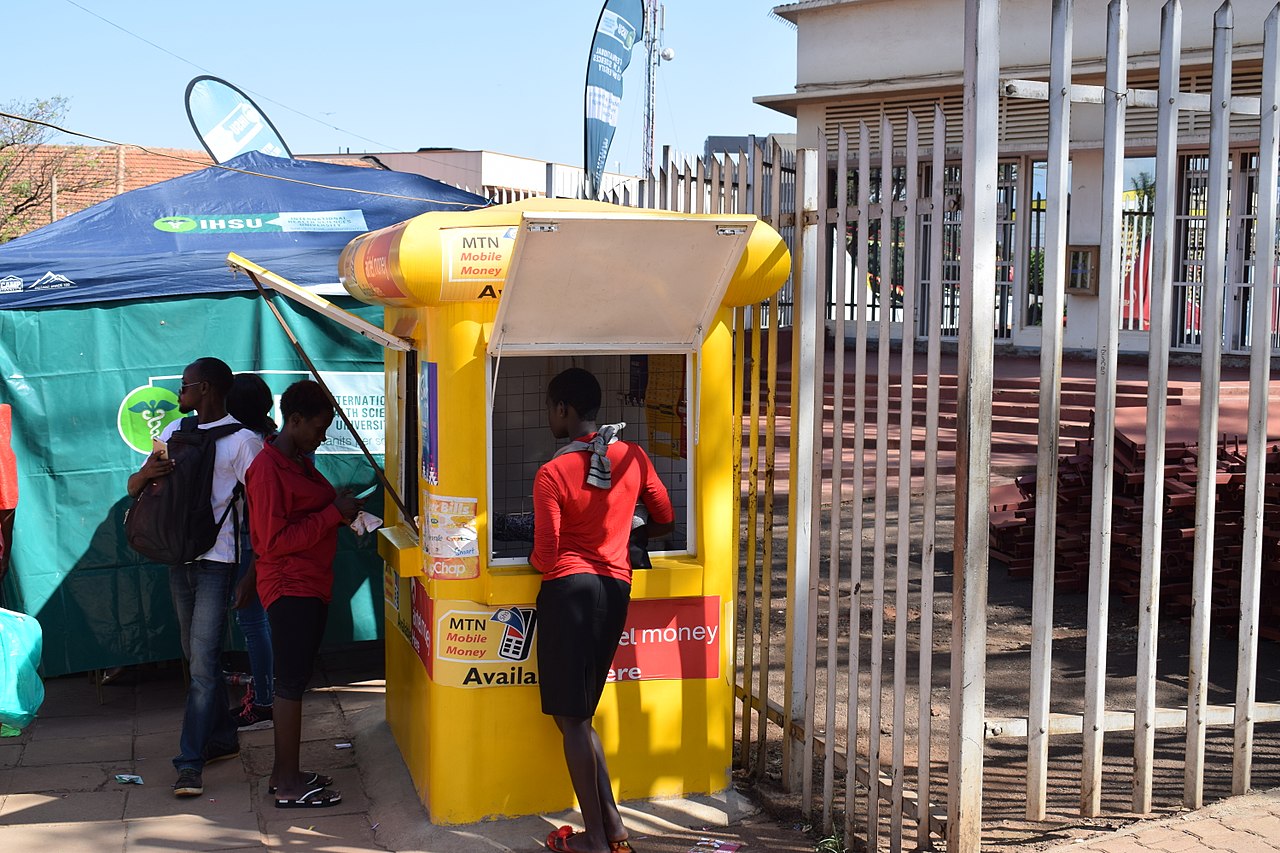
Mobile money kiosk in Uganda, illustrating the retail transfer and payout infrastructure discussed in this entry.
What this entry looks at
This entry uses data from the World Bank’s Remittance Prices Worldwide (RPW) database, a quarterly dataset that tracks actual prices charged by banks, money transfer operators, and mobile money providers across hundreds of send-receive country pairs. We use Q1 2025 data for Sub-Saharan Africa, covering 33 destination countries.[1]
Coverage includes routes from outside Africa and routes within Africa. For one destination country, both route types can appear; Uganda, for example, includes United Kingdom → Uganda and Tanzania → Uganda in this sample.[1]
What this entry is not: It is not a volume-weighted estimate of total household burden. It is a destination-level comparison, useful for seeing where costs are high and why, not for calculating an exact national welfare loss.
What this entry answers
- How wide the cost gap is across destination countries right now.
- How costs have changed since 2011.
- Which specific routes are pushing costs highest.
- How the method you use to send affects what you pay.
- How much of the cost is exchange rate markup versus other fees.
- Whether the main findings hold up under different ways of measuring.
- Which policy changes the data most clearly supports.
The spread: 3% to 43% in the same region
In Q1 2025, destination-country average costs across Sub-Saharan Africa run from 3.01% (Sudan) to 43.35% (Malawi), with a median of 6.94% and a mean of 9.98%.[1] That 40-point gap between the cheapest and most expensive destinations is the central finding. It tells you that “Sub-Saharan Africa” is not one remittance market. It is dozens of different markets with very different cost structures.
3.01% to 43.35%
Median 6.94%
28 of 33
Top 10 Highest Destination Costs in Sub-Saharan Africa
So what this means
A regional average near 9% can still coexist with destination outcomes above 40% in one case and above 25% in another.[1][3]
Regional averages are useful context, but they are not enough for policy design. The high-cost end needs direct route-level attention.
Has it been getting better?
Yes, meaningfully, but not enough.
Using the same method across time, the typical (median) destination cost fell from 14.81% in Q1 2011 to 6.94% in Q1 2025, a drop of nearly 8 percentage points over 14 years. That is real progress.[1]
But the mean fell more slowly, from 13.49% to 9.98%. When the median falls faster than the mean, it means the middle of the distribution improved while the expensive end stayed expensive. The high-cost tail is sticky.[1]
SSA Cost Trend Checkpoints
So what this means
The chart shows the same pattern: meaningful progress over time at the center of the distribution, but no convergence to the 3% SDG target.
Driver 1: How you send the money matters a lot
Before we even compare corridors, method choice changes what people pay.
In the same Q1 2025 service-level RPW sample, average cost by payment instrument runs from 4.78% for mobile money (n=17) to 15.08% for bank account transfer (n=399). By payout method, it runs from 6.43% for mobile wallet (n=276) and 7.37% for cash (n=860) to 16.02% for bank account payout (n=313).[1]
These are raw averages, not controlled comparisons. Bank-account routes tend to concentrate in corridors that are already expensive for other reasons too. So the method gap is real, but it is not purely caused by the method itself, and the corridor and destination mix also plays a role.[1]
Method Mix Cost Gradient (Q1 2025)
So what this means
The chart shows a clear method gradient: bank-account transfer averages 15.08% versus 4.78% for mobile money, and bank-account payout averages 16.02% versus 6.43% for mobile wallet and 7.37% for cash.
The pattern is still meaningful: bank-based routes are consistently at the expensive end, and mobile money and wallet-based routes are at the cheaper end. Expanding digital payout access is one of the most direct levers available.[1]
Driver 2: The specific route matters more than the country average
Country-level averages hide something important: within the same destination country, the cost can vary enormously depending on where the money is coming from.
Take Kenya. The average cost to send money to Kenya is 17.21%. But that average combines routes that range from 4.44% (UK → Kenya) to 58.18% (Tanzania → Kenya). That is a 54-point gap inside one destination.
Uganda is similar. Its average is 26.85%, combining 5.04% (UK → Uganda) to 63.63% (Tanzania → Uganda).[1]
Corridor Decomposition for Top-Cost Destinations
So what this means
The chart shows why country averages can mislead: corridor costs inside the same destination are very far apart, with Kenya ranging from 4.44% to 58.18%, Uganda from 5.04% to 63.63%, and Malawi appearing as one corridor at 43.35%.[1]
The Tanzania → Uganda and Tanzania → Kenya corridors are extreme outliers. They have far fewer service observations, 10 each, than the UK corridors, 33 and 32 respectively, which suggests limited competition on those specific routes is part of the problem.[1]
Malawi has only one corridor in this quarter’s data: South Africa → Malawi. Its 43.35% average is not pulled up by one bad provider in a diverse market; it reflects the whole corridor.[1]
If policy focuses only on national averages, the most expensive routes will be missed. The data points to corridor-level supervision and transparency.
Driver 3: Exchange rate markup versus other fees
The total cost of sending money has two main components:
- Exchange rate margin, the gap between the mid-market exchange rate and the rate the provider actually gives you.
- Non-exchange-rate fees, transfer fees, service charges, and other costs.
Across the SSA destination sample in Q1 2025, the average split is roughly 31% exchange rate margin and 69% other fees. But at country level, this varies enormously, and the variation matters for what kind of intervention would actually work.[1]
At country level, the split is highly uneven:
FX Versus Non-FX Cost Stack
So what this means
Cost stacks are structurally different across destinations. Some are primarily FX-margin driven, while others are primarily non-FX pricing problems.
Malawi and Gambia are predominantly exchange rate problems, over 70% of total cost is the exchange rate markup. Mali, Lesotho, and Eswatini are the opposite: almost all of their cost is in fees and service charges, with almost no exchange rate margin.[1]
A policy that targets exchange rate transparency (making providers show you the real rate) would help Malawi and Gambia. It would do almost nothing for Mali. A policy that caps service fees would help Mali but not address Malawi’s core problem. One-size-fits-all approaches will underperform.
How big is the excess cost?
At a 9.98% sample mean, the excess above SDG’s 3% benchmark is 6.98 percentage points. On a USD 200 transfer, that is roughly USD 14 extra per transaction relative to the SDG benchmark level.[1]
Using RemitSCOPE’s Africa inflow context of about USD 104 billion in 2024, a simple scale-up gives an implied excess annual cost of about USD 7.26 billion relative to a 3% benchmark.[6] This is illustrative, not a welfare estimate, because the inflow figure is continent-wide (including North Africa) while the pricing sample here is Sub-Saharan destinations only and not volume-weighted.
Why do costs stay high?
The World Bank data and a separate 2025 analysis by the South African Reserve Bank (SARB) identify the same repeating patterns in high-cost corridors.[3]
- Too few providers on specific routes. When one or two providers dominate a corridor, there is little pressure to compete on price. The Tanzania → Uganda and Tanzania → Kenya corridors, with only 10 service observations each, are consistent with thin competitive markets.
- Regulatory barriers that keep new providers out. Licensing requirements, exclusivity agreements between banks and money transfer operators, and anti-money laundering compliance costs all add to entry barriers.
- Exchange rate volatility in stressed currency environments. Providers operating in markets with volatile currencies often price in a large buffer, inflating the exchange rate margin.
- Fragmented payment infrastructure. When mobile wallets, bank accounts, and cash networks do not connect well across borders, settlement costs stay high and options stay limited.
These factors often stack on the same corridor, which is why some routes stay expensive even as global averages slowly improve.
What the data supports doing
The evidence supports targeted action, not a single regional fix. Responsibility sits across three groups:
Governments and regulators:
- set rules on competition, price disclosure, and interoperability;
- can require full FX and fee transparency on high-cost corridors;
- can set corridor-level cost targets instead of only national averages.
Banks and money transfer providers:
- set fees and FX spreads within those rules;
- can expand account-to-wallet and wallet-to-wallet options that the method-mix evidence associates with lower costs.
Payment system operators:
- shape how fast and cheaply money moves across borders;
- can reduce costs by improving cross-border interoperability, especially for intra-African corridors.
Each of these priorities is measurable with the same RPW fields used here.
External confirmation
SARB’s corridor analysis reaches a similar conclusion: costs above 10% in about three out of four SSA corridors, and only two SSA corridors under 3%.[3] The World Bank June 2025 data note also flags wide country divergence, with 28 countries globally still above 3% and several African destinations above 7%.[5]
How reliable is this analysis?
Coverage and precision are uneven in Q1 2025:
- 33 destinations have usable observations, 13 of 46 SSA destinations in the entry universe have no non-negative observations.
- 14 of 33 observed destinations are built on a single corridor.
- 21 of 33 observed destinations are built on two or fewer corridors.
- 11 of 33 observed destinations have 20 or fewer service observations.
Destinations without usable Q1 2025 observations in this entry pipeline: Benin, Burkina Faso, Burundi, Central African Republic, Chad, Gabon, Guinea, Guinea-Bissau, Mauritania, Mauritius, Niger, Seychelles, and São Tomé and Principe.[1]
Sensitivity checks on the Q1 2025 SSA country distribution:
| Statistic | Value |
|---|---|
| Unweighted destination mean | 9.98% |
| Corridor-weighted destination mean | 9.54% |
| Service-weighted destination mean | 10.30% |
| 5-95 trimmed destination mean | 8.69% |
| Destination mean excluding Malawi and Uganda | 8.36% |
Even excluding the two most expensive destinations, the mean is still 8.36%, nearly three times the SDG target. The finding is robust.[1]
The core finding survives these checks: costs remain high, and the tail remains heavy.
Limitations
- The trend analysis uses an unbalanced country panel over time (country count varies by quarter), so period-to-period changes combine price movement and coverage movement.
- The aggregation is unweighted by corridor transaction volume, which can differ from household-level burden.
- Method-mix averages are descriptive, not causal estimates, because corridor and destination composition differ across method categories.
- Component splits use implied non-FX residuals (total cost minus FX margin), so they are diagnostic rather than a full accounting decomposition.
Sources
References
- World Bank Remittance Prices Worldwide dataset, Issue 53 (Q1 2025), workbook: https://remittanceprices.worldbank.org/sites/default/files/rpw_dataset_2011_2025_q1.xlsx
- World Bank, Remittance Prices Worldwide, Issue 53 (March 2025) report: https://remittanceprices.worldbank.org/sites/default/files/rpw_main_report_and_annex_q125_1_0.pdf
- South African Reserve Bank, “Understanding Cost Patterns in Remittance Corridors of Sub-Saharan Africa” (2025): https://www.resbank.co.za/content/dam/sarb/what-we-do/payments-and-settlements/cross-border-payments-conference/documents/paper-cost-patterns-remittance.pdf
- UN DESA Policy Brief No. 196 (Nov 2025), “Developments in global remittance flows”: https://policy.desa.un.org/publications/developments-global-remittance-flows
- World Bank Open Data story (June 16, 2025), “The cost of sending remittances is higher than 3% in 28 countries”: https://www.worldbank.org/en/opendata/the-cost-of-sending-remittances-is-higher-than-3—in-28-countries
- RemitSCOPE Africa regional overview page: https://remitscope.org/africa/